M-ishka
Color blocking and surface-mixing to enrich the quality of the materials
-
Client
M-ishka -
Industry
fashion -
Location
serbia
Notice: Undefined index: purpose in /home/wp/mk_lumina/wp-content/themes/lumina/template-parts/content.php on line 75
Mishka is a Serbian accessories brand founded by designer Emilia Katić. The brand first became famous for its handmade, hand-sewn and uniquely tailored espadrilles, but today their range of products includes slippers, belt bags and totes.
At the end of 2018, the label was looking to expand their branding with a new commercial editorial campaign. Together with Metaklinika design studio we were commissioned to make a series of photographs in order to create their new visual branding identity and concept system.
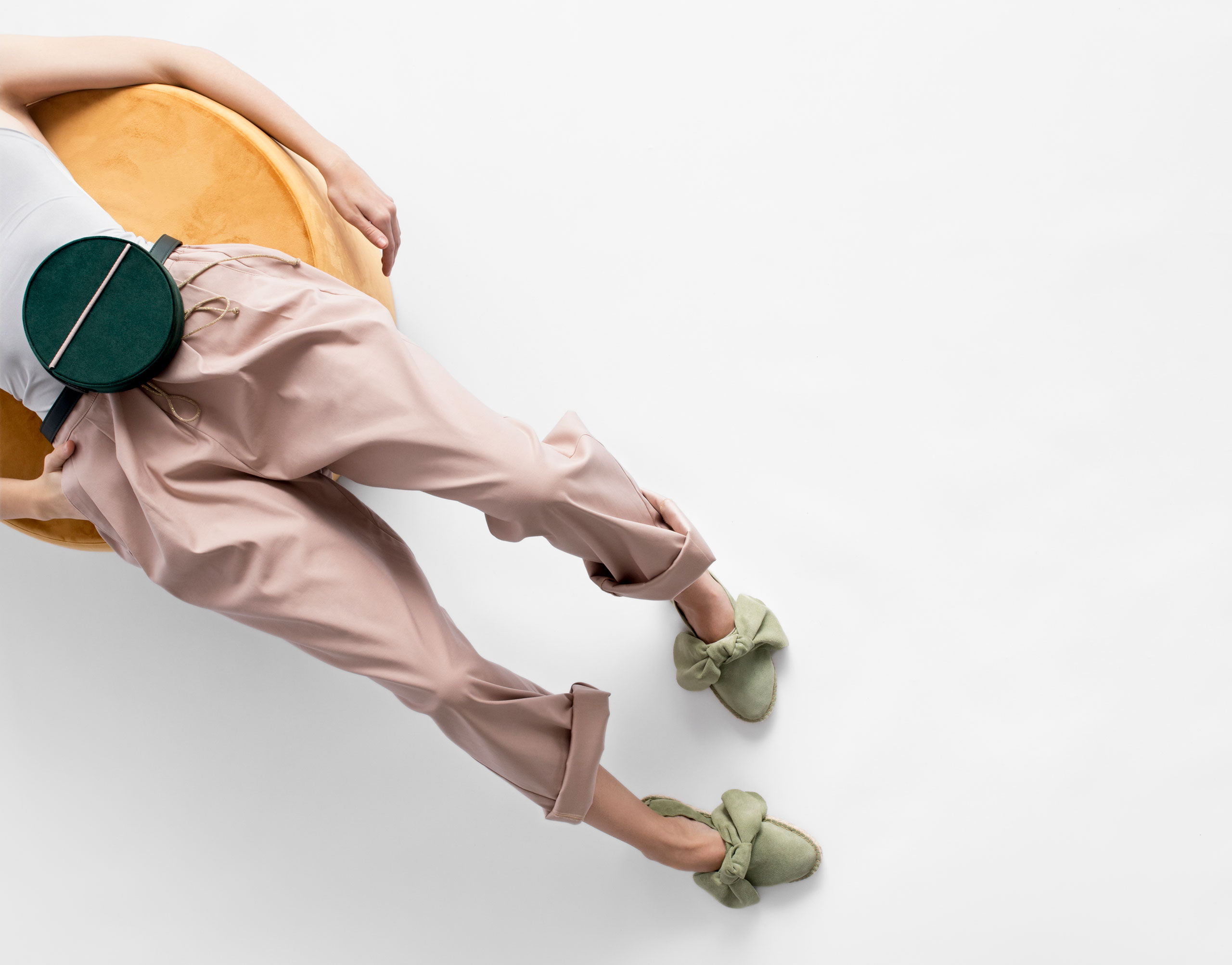
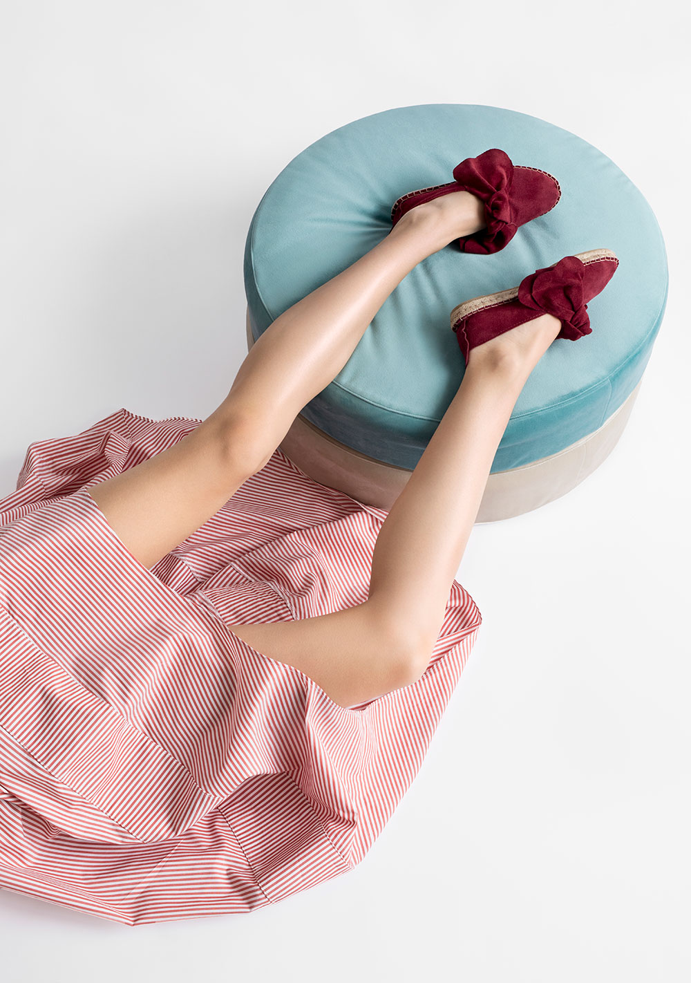
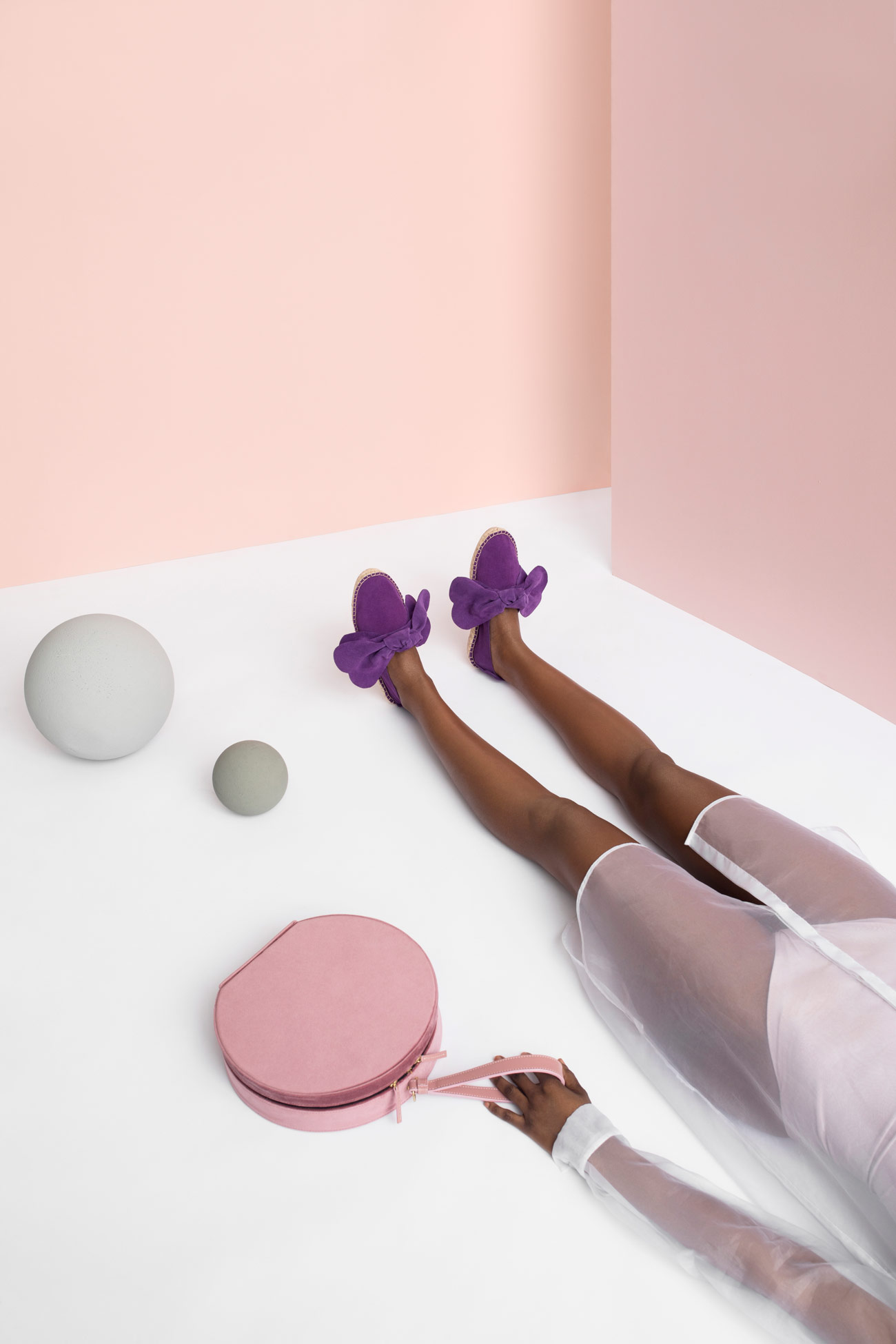
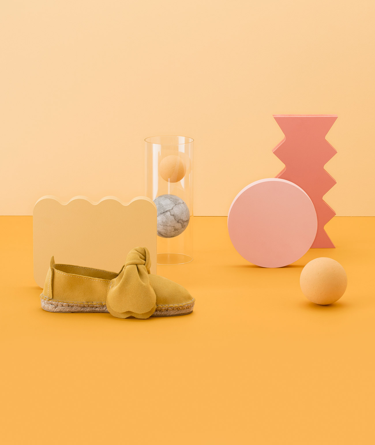
As traveling is the focal inspiration behind the brand’s ideology – the idea was to metaphorically convey it through the editorial. Geometrical and architectonic elements were strategically placed in order to represent world maps, and, through color blocking, we wanted to transmit freshness, an easygoing lifestyle and an overall positive, adventurous outlook on life.
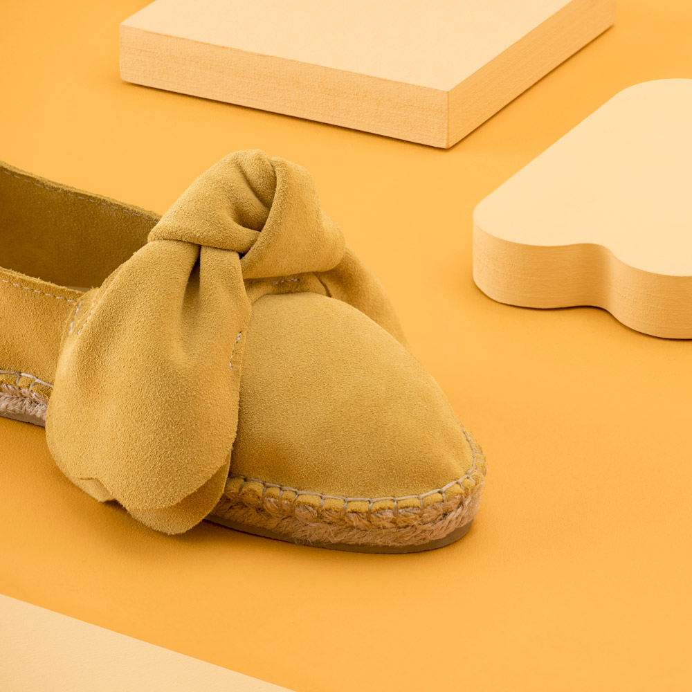
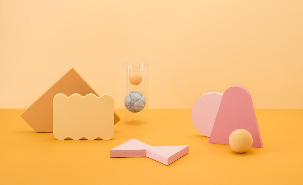
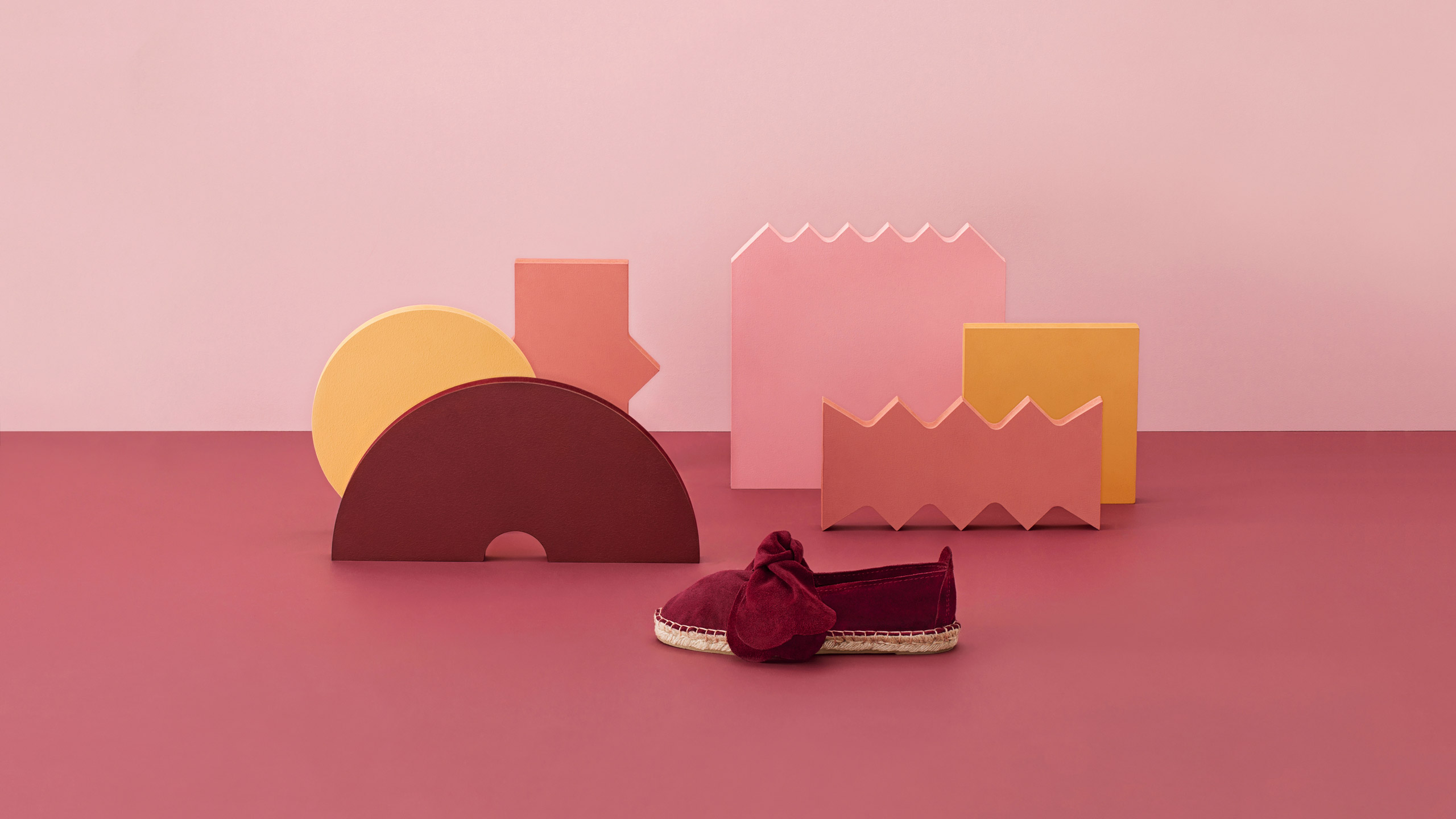
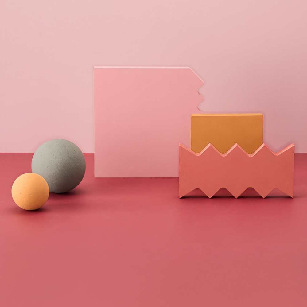
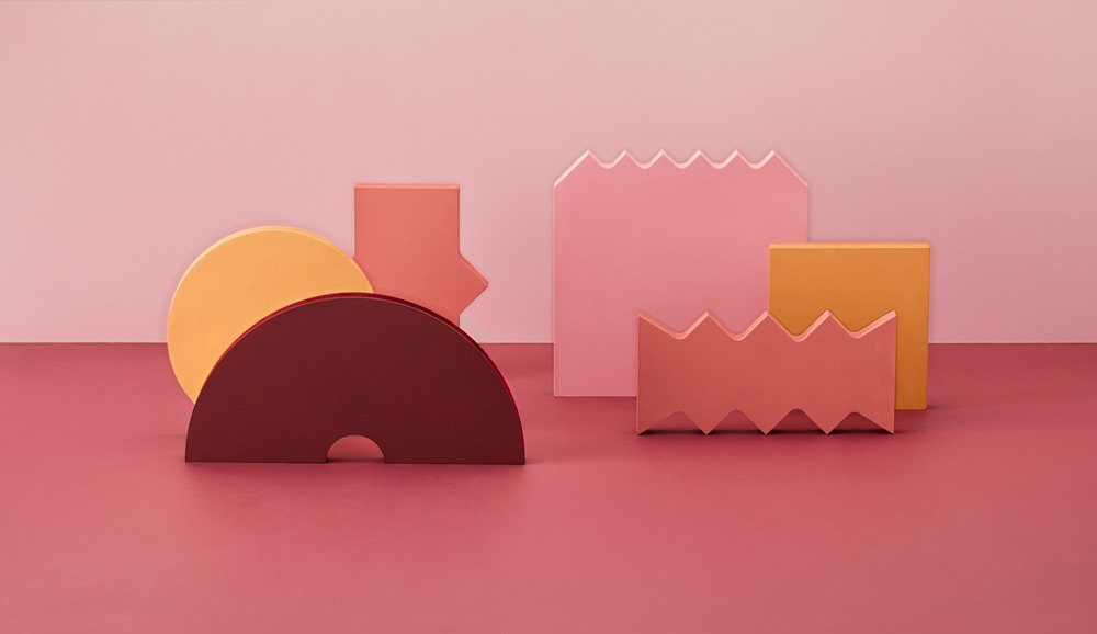
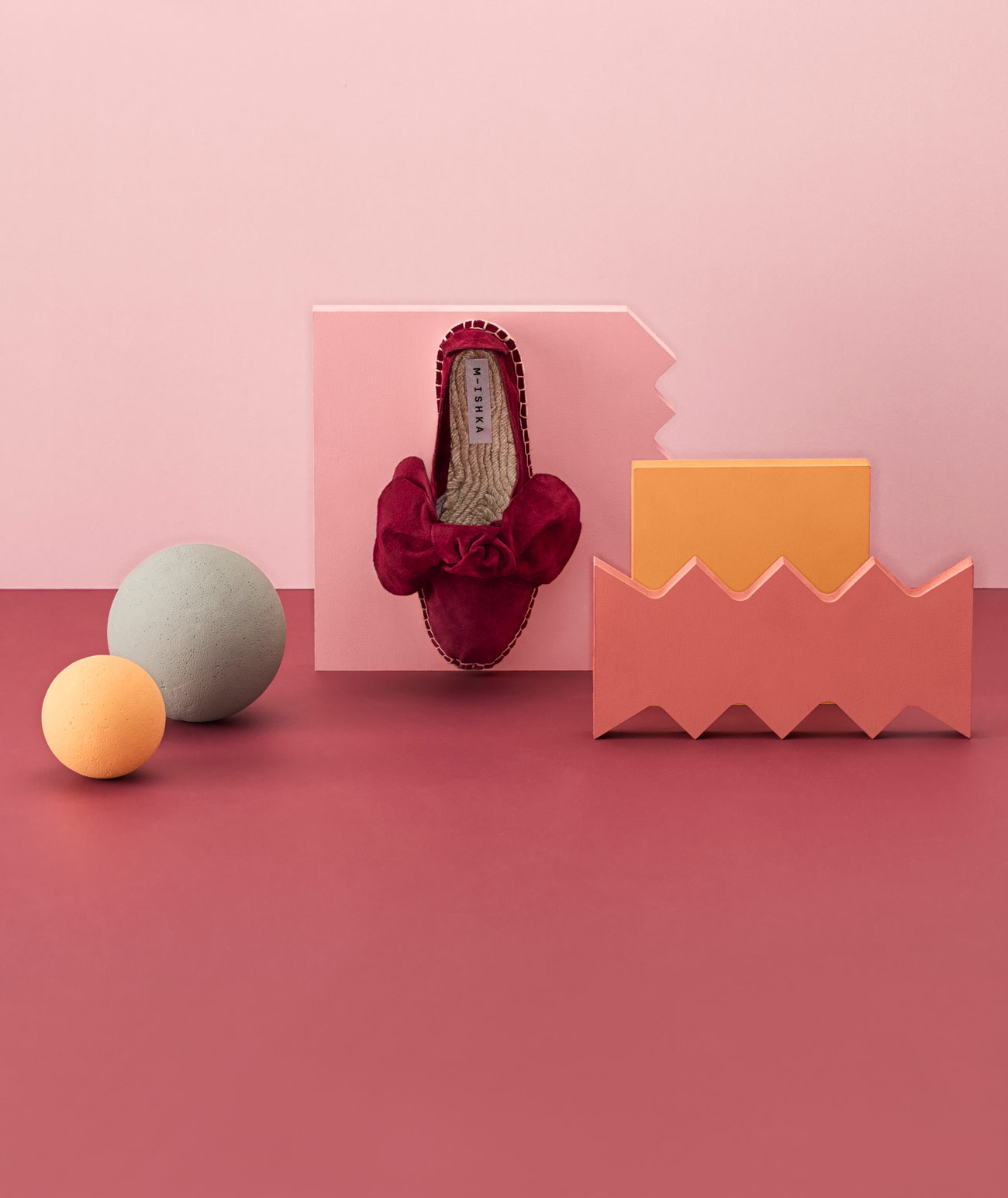
Carefully chosen textures and color schemes were an integral part of the campaign:
“The different surfaces in various forms and hard textures were specifically selected to be in obvious contrast with the soft feel of the M-ishka products and in that way enhance the quality of materials used to make them.”
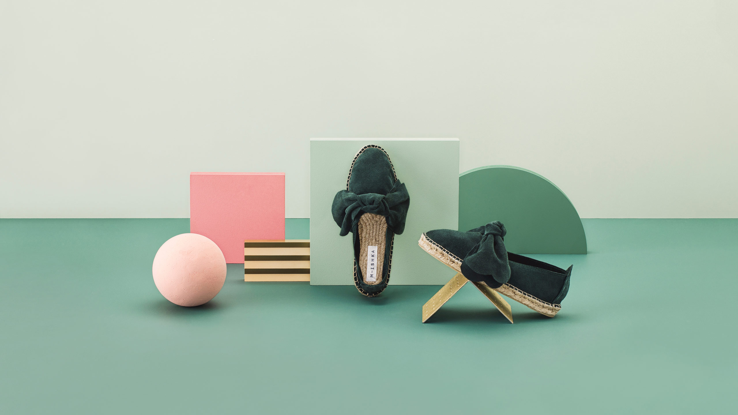
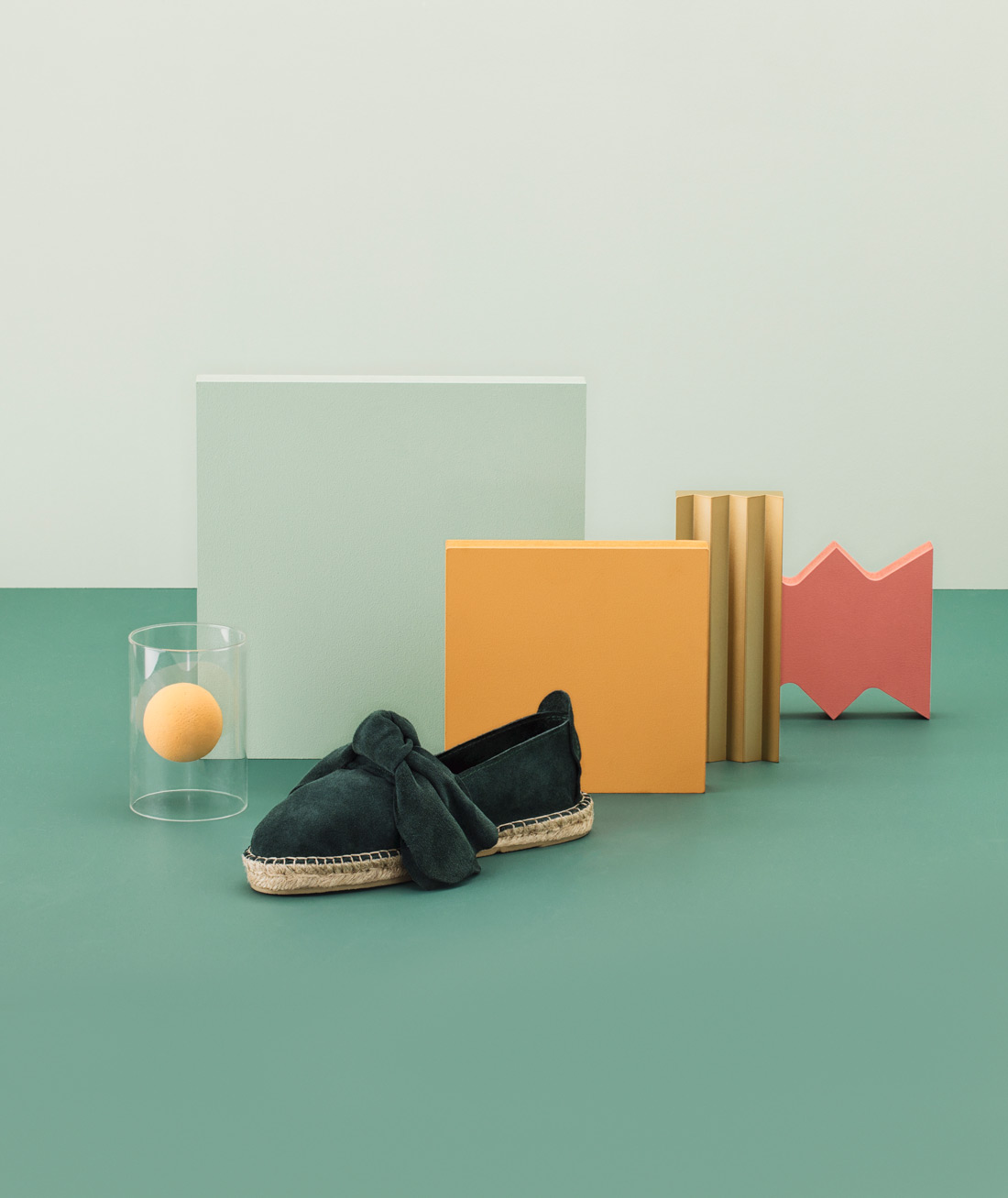
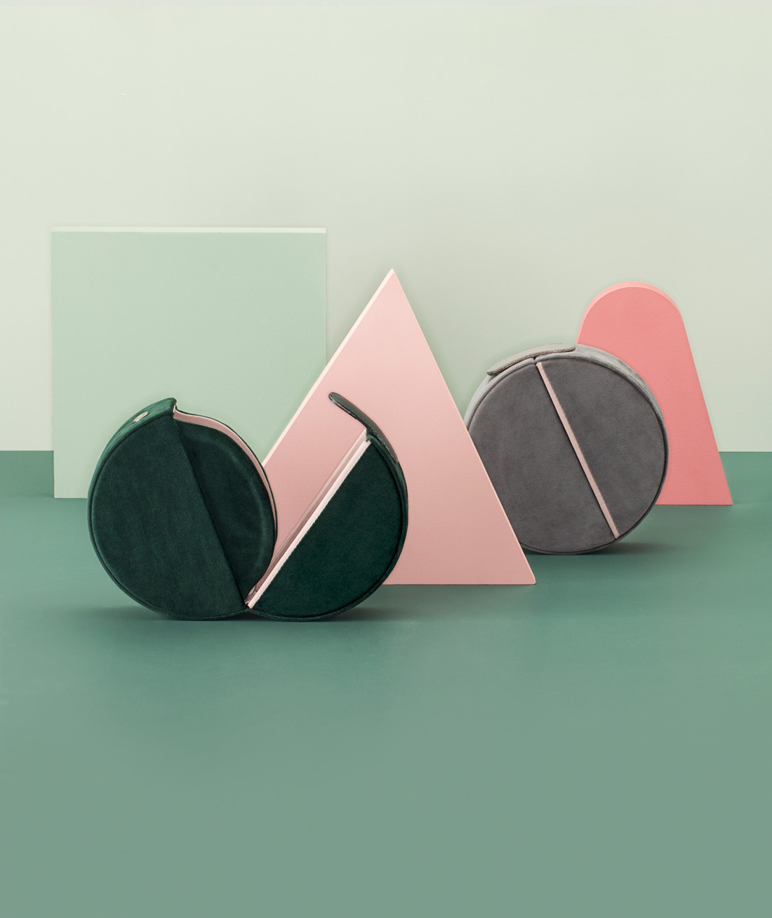
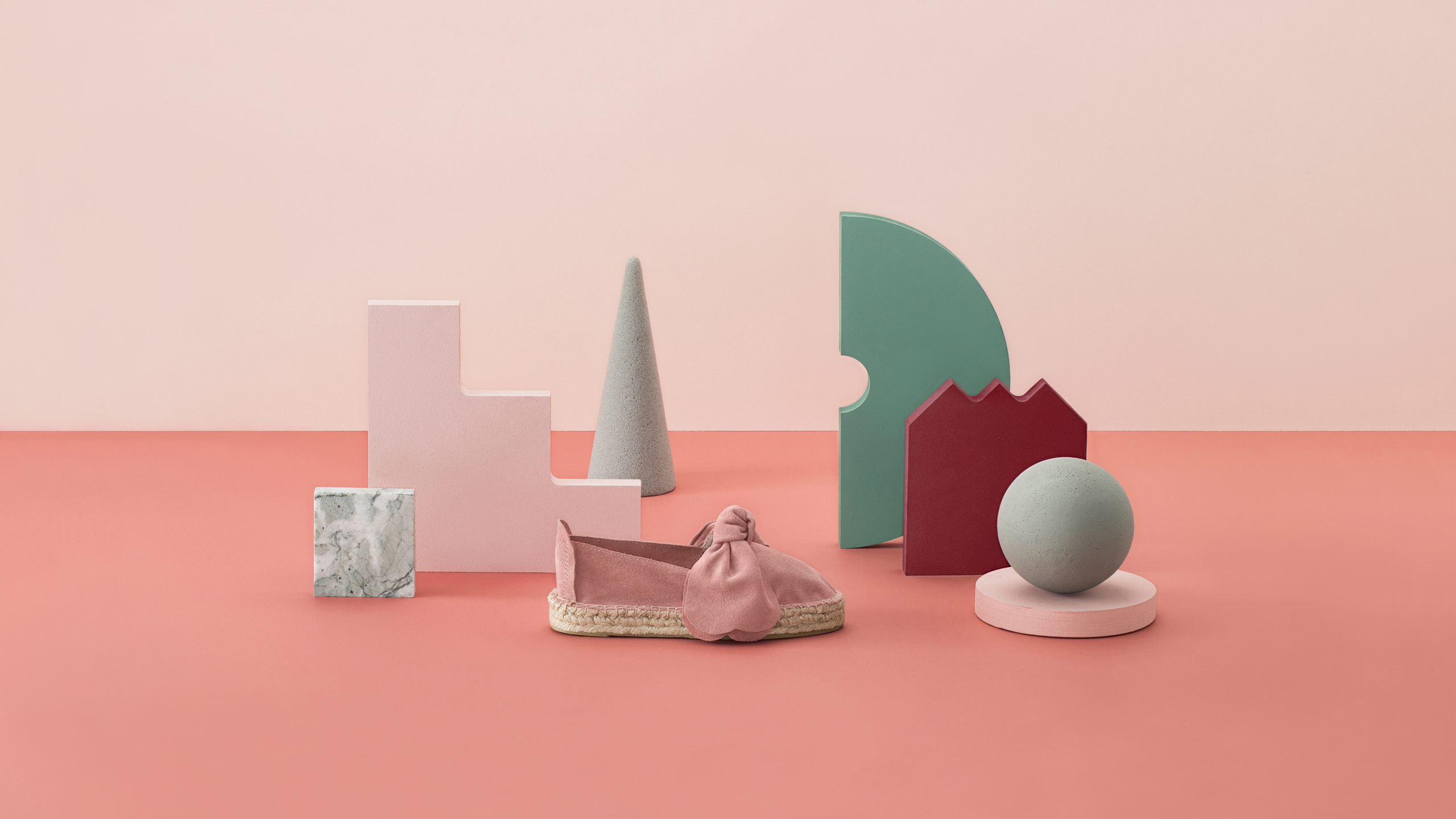
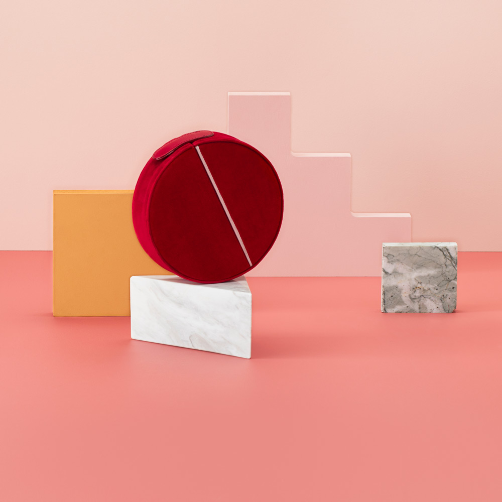
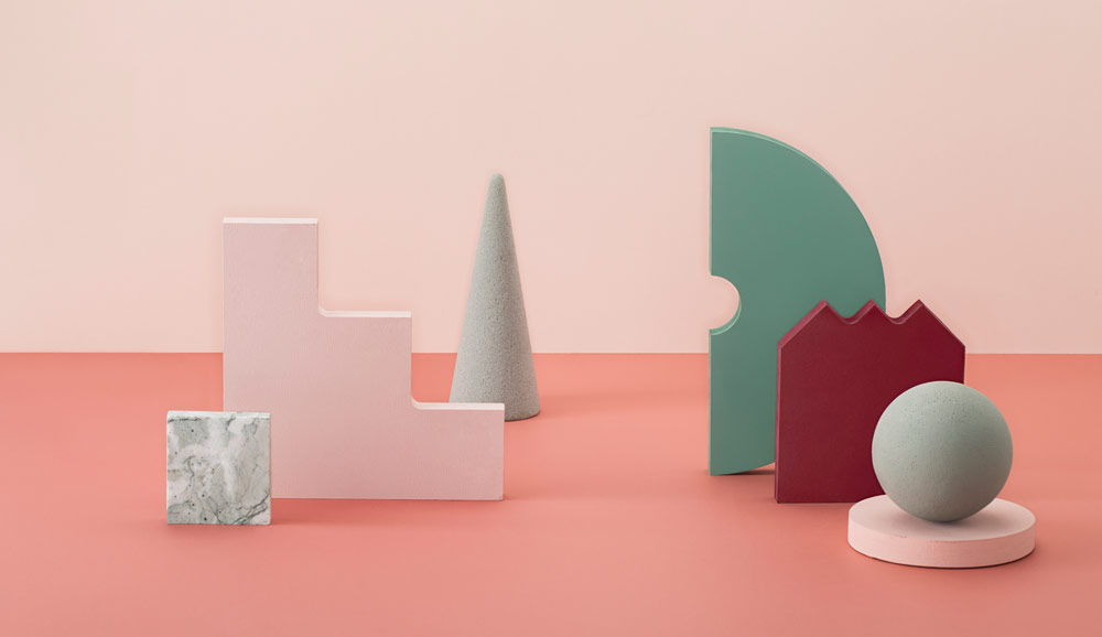
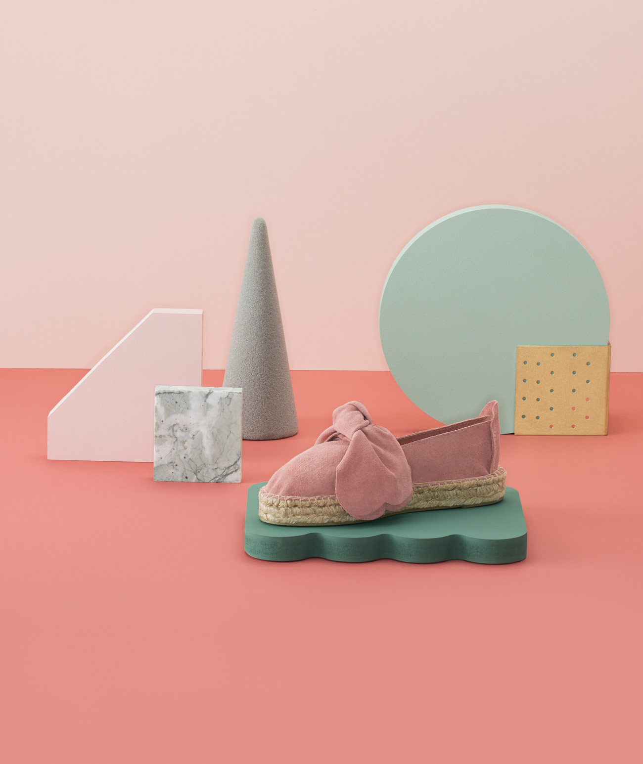
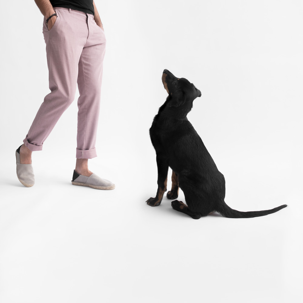
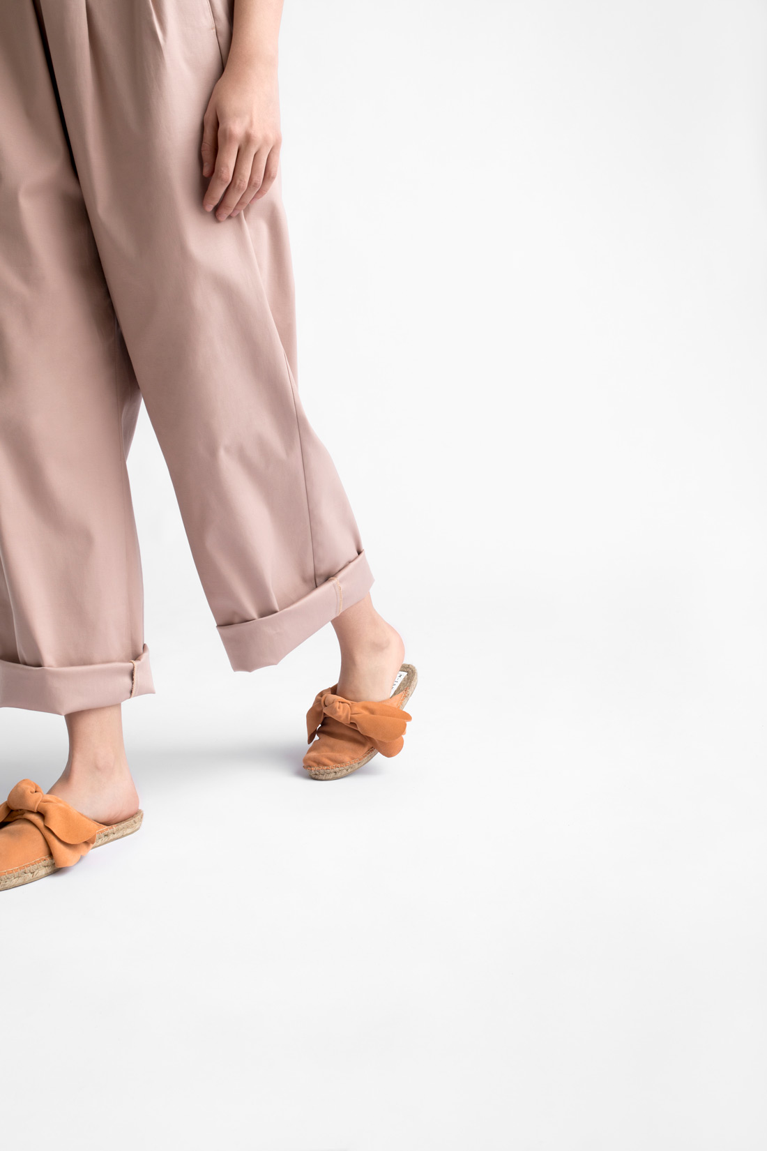
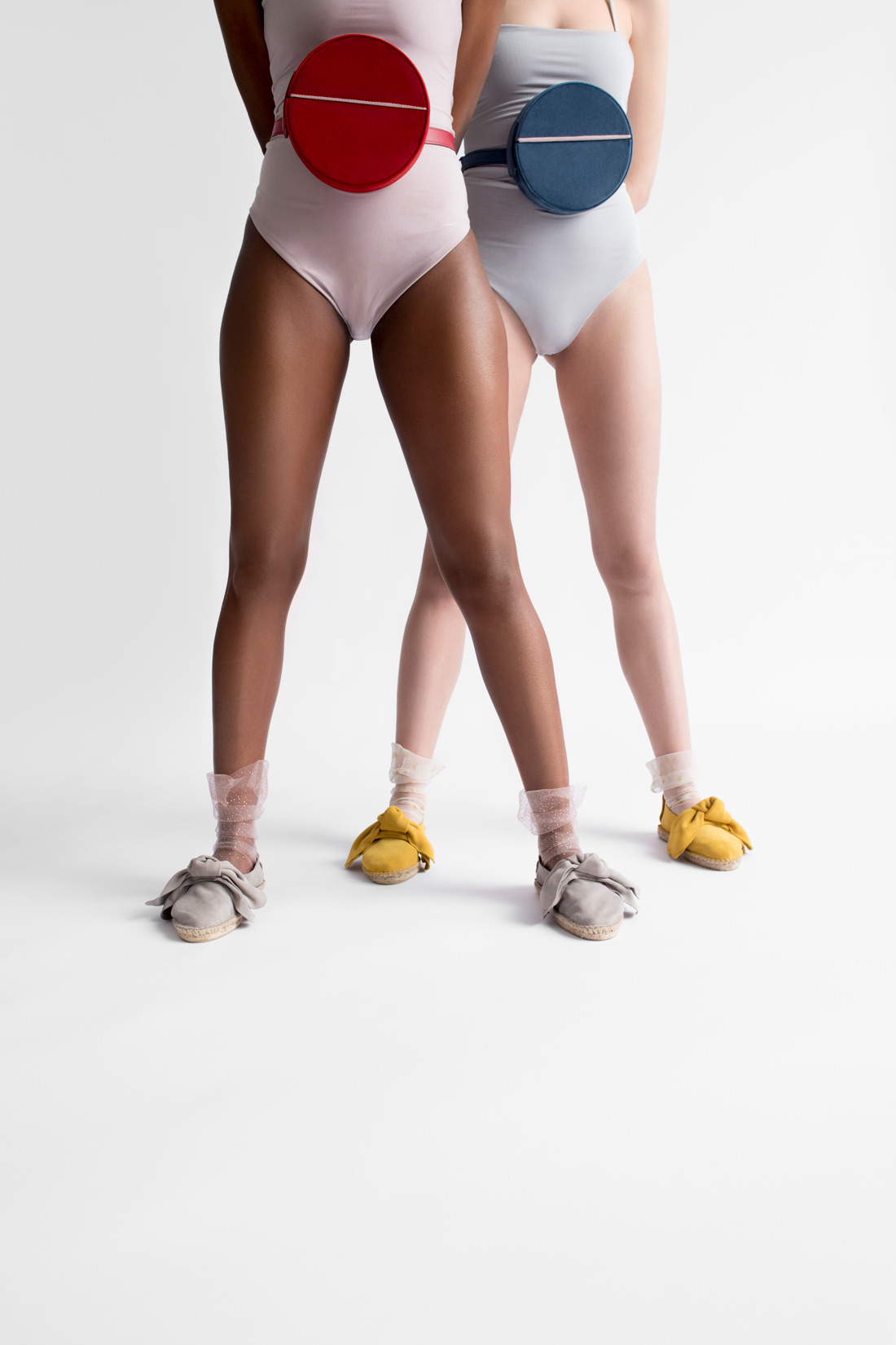
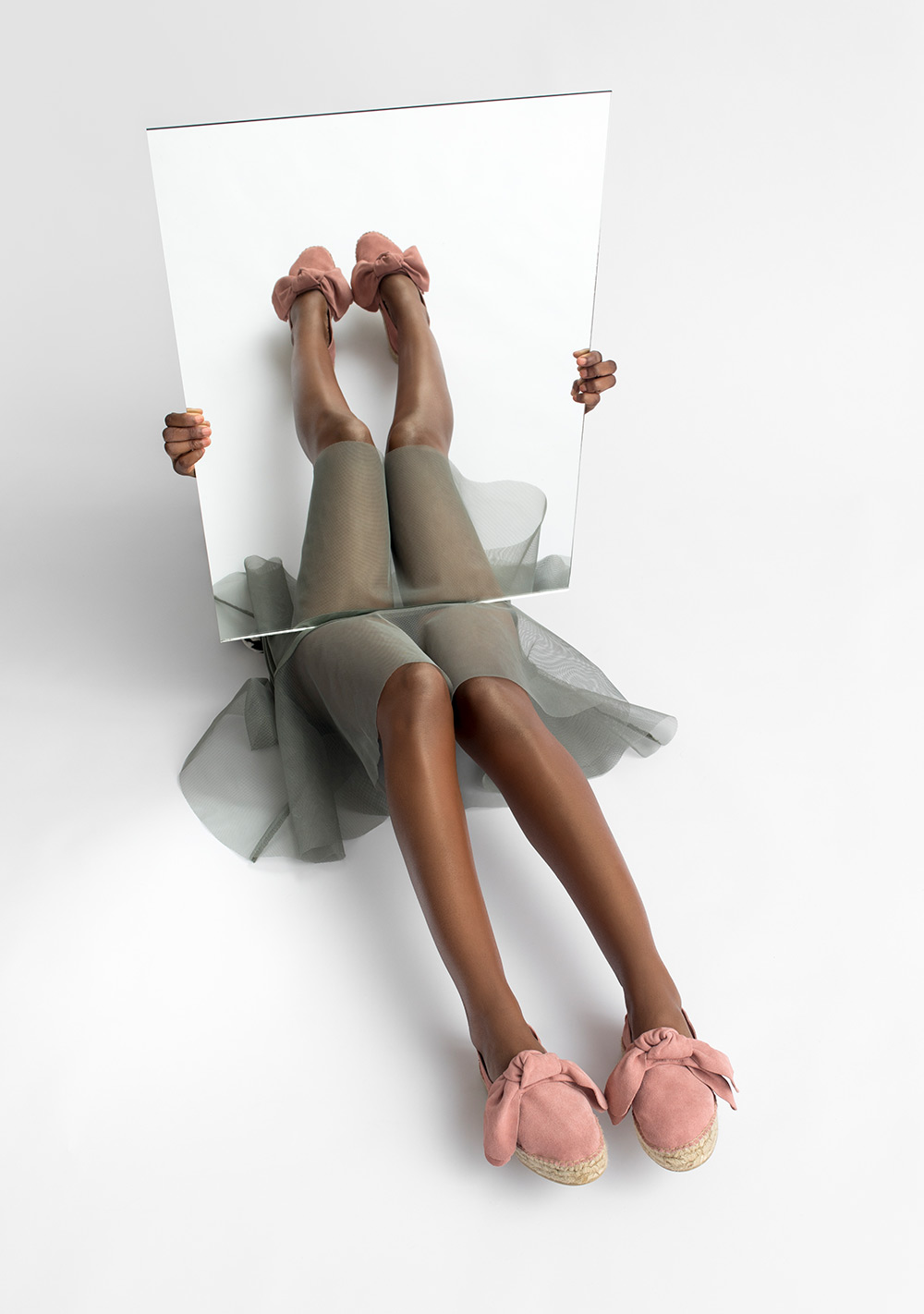
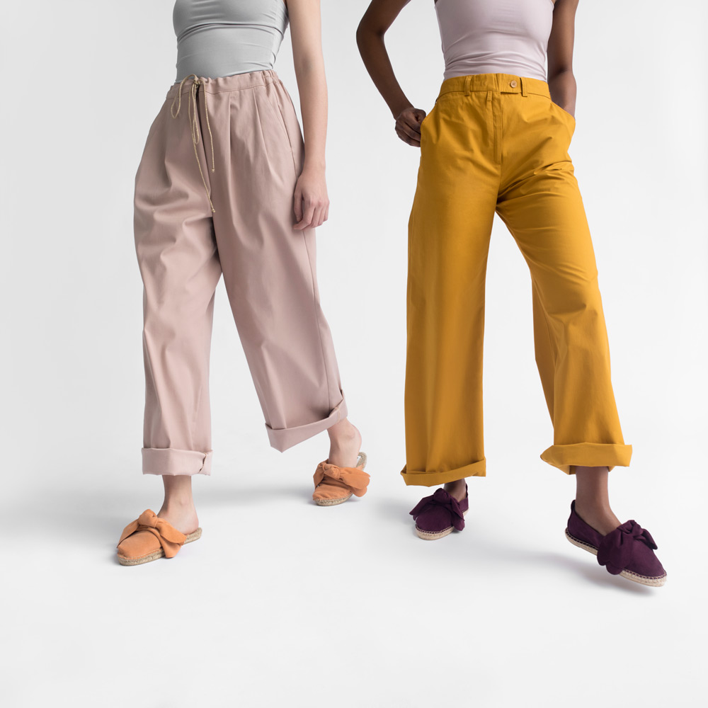
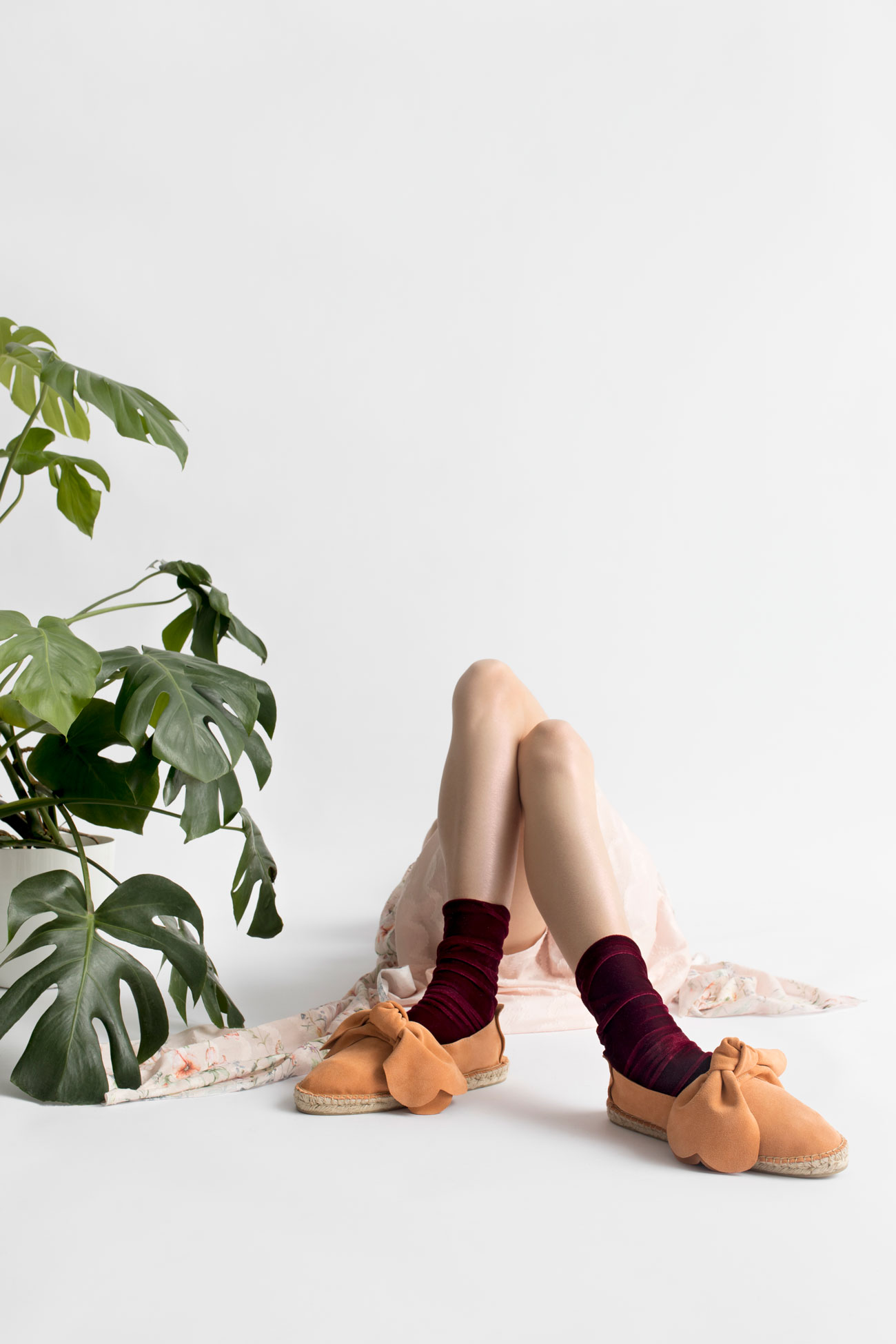
The campaign consisted of two different segments – the first, where we represented accessories on models, and the second, where we created virtual spaces for the accessories. In combining the two, a strong visual identity was made based on solid geometric shapes that coalesced with fluid, natural forms. By letting these two work together, we made a world of contrast that convincingly says:
Soft yet strong, gentle yet durable, eye-catching but easy to wear, remarkable but unpretentious – M-ishka.
